
Post author: P'tit Style
Publication date: 28/09/2026
White, black, grey, pastel or a bright colour? How to choose the backdrop colour that flatters your subject — portrait, product, newborn, food, social — without getting it wrong.
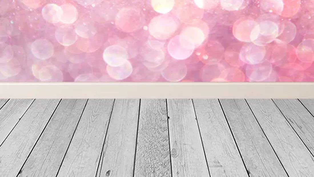
The colour of your backdrop is not a minor detail: it sets the mood, brings out (or flattens) your subject, and tells a story. White, black, pastel, bold and bright? Here is how to choose the right backdrop colour depending on what you are shooting, with simple guidelines and no mistakes.
The great classics and what they say
| Colour | Effect | Ideal for |
|---|---|---|
| White | Neutral, bright, “e-commerce” | Product packshots, corporate, catalogues |
| Black | Dramatic, elegant, high contrast | Portrait, beauty, premium objects |
| Neutral grey | Goes with anything, gradients possible | Portrait, CV, all-rounder |
| Pastel | Soft, tender, modern | Newborn, fashion, light food |
| Bright colour | Energetic, “pop”, memorable | Social media, children, creative |
Portrait: flatter the skin and the eyes
For a portrait, think contrast and temperature. A dark backdrop (black, charcoal grey, midnight blue) makes a lit face stand out and adds character. A light, neutral backdrop (light grey, off-white) gives a clean, corporate look. Avoid a colour that “bounces” onto the skin (a very saturated backdrop can tint the face). Simple rule: the backdrop colour should bring out the eyes, not compete with them.
Product / packshot: legibility above all
In product photography, the backdrop serves the product, not the other way around. White remains king for e-commerce (easy cut-outs, the standard marketplace background). A light grey adds volume and a softer, more natural shadow. For a premium object, a black backdrop or a matching muted colour creates an “ad” image. Tip: choose a colour that complements the product to make it pop without hiding it.
Newborn, family, food: the softness of pastels
Pastels (beige, powder pink, sage green, sky blue) bring softness and a modern feel: perfect for newborn, maternity, children's fashion or bright food photography. They stay discreet while warming up the image. For food, a light, matte backdrop avoids reflections and lets the dish shine.
Social media: dare to use colour
On Instagram or in a creative packshot, a bright colour (yellow, coral, bold blue) catches the eye in a crowded feed and becomes a brand signature. Keep it consistent: 2 or 3 recurring colours are enough to build a recognisable identity.
Three habits to get it right
- Contrast: a light subject on a dark backdrop (and vice versa) to separate it.
- Temperature: a warm backdrop to warm things up, a cool one to calm them; match it to the mood you want.
- Restraint: when in doubt, a neutral grey or a white never lets you down.
Frequently asked questions
Which backdrop colour for a portrait?
A dark backdrop (black, charcoal grey) for character, or light grey/off-white for a neutral, corporate look.
Which backdrop to sell a product online?
White for e-commerce (cut-outs, marketplace standards), light grey for a soft shadow, black for a premium object.
Are bright, bold backdrops risky?
Not if you control them: keep the subject in contrast and avoid the colour bleeding onto the skin. Perfect for social media.
One colour to do it all?
Neutral grey: it goes everywhere and even allows gradients from light to dark depending on the lighting.
Ready to choose your colour? Build your set to the exact centimetre in our custom backdrop creator, or browse our plain backdrops and ready-to-print sets.